
From Gray CRM To Living Product
Written by Charbel Habchy • Published November 17 2025
For the last ~1.5 months I have been working with the OnlyLinks team on something I have wanted for a long time:
Turn OnlyLinks from a boring, gray, CRM looking tool into a product that actually feels alive.
Same core idea. Completely new UI and UX.
The funny part is that v1 did not come from a bad place. It was the classic move: ship something fast, prove it works, keep adding features. Over time we ended up with a product that functioned well, but visually felt like every other dashboard on the internet.
v2 is where we finally paused, zoomed out, and rebuilt the experience to match what OnlyLinks actually is.
What Was Wrong With v1
v1 did its job, but visually it had a few big problems:
- It looked like a generic admin dashboard template
- Lots of flat gray and white surfaces
- Thin borders and basic cards that all felt the same
- Navigation that felt very "tool list", not a real system
If you squinted, you could swap the logo and it might as well be any random CRM.
There was also a subtle issue: the interface was not telling you what mattered. Metrics, tables, and buttons all sat on the same visual level. You could accomplish tasks, but the UI was not guiding you emotionally or visually.
Creators and teams are building their brands in OnlyLinks. The product did not feel like it belonged in that world yet.
Design Goals For v2
When we started the redesign, we set a few simple goals that we kept coming back to in every review:
Make OnlyLinks feel like a brand, not a template
Color, gradients, and motion should be baked into the core language, not just dropped on top at the end.Build one consistent design system
Same spacing, same corner radius, same shadows, same motion rules everywhere, so every new feature feels native from day one.Make the app feel lighter and more human
Less "rows in a database", more "control center for your presence", with surfaces that feel modern instead of corporate.Use layout to guide people, not confuse them
Clear sections for Organizations, personal tools, and admin features so your brain always knows where it is in the product.
The entire redesign was basically us asking one question over and over:
If I saw this screen without a logo, would I still know it is OnlyLinks?
If the answer was no, we kept iterating.
The OnlyLinks Brand Guidelines And Design Language
One of the biggest pieces behind v2 is something you do not see on any single screen by itself:
The brand language that sits underneath everything.
Before we touched the product, I sat down and designed a full visual and interaction language for OnlyLinks from the ground up. That work now lives on our public brand guidelines page:
onlylinks.com/brand-guidelines
This is not just a moodboard or a color palette. It is the source of truth for how OnlyLinks should look and feel everywhere:
- The core gradient fields and how they blend into backgrounds
- The glassy surfaces, shadows, and elevation levels
- The typography hierarchy, from big hero headlines down to tiny labels
- The motion rules for how things enter, exit, and react
- The spacing and layout rhythm that keeps screens feeling balanced
Every decision in v2 starts there. If a new screen or component does not fit the language in the brand guidelines, it is wrong until we fix it.
The goal was to create a design language that is recognizably OnlyLinks even without the logo:
- Soft but sharp
- Gradient heavy but still clean
- Modern and fluid without feeling like a Dribbble shot pasted into a real product
The v2 UI is basically that brand system brought to life across the entire app.
Color, Gradients, And Depth
The biggest visual jump is the color.
- Backgrounds are no longer just gray. We use soft gradients and light color washes so the app feels like it has an atmosphere.
- Primary CTAs live on rich, smooth gradients that tie back to the OnlyLinks brand.
- Cards sit on top with subtle shadows and rounded corners, so the interface has real depth instead of feeling stamped on.
Under the hood, this is all driven by a tighter color system:
- A primary gradient set used for navigation and key actions
- A gentle neutral set for backgrounds and card surfaces
- Accent colors reserved for things like alerts, status, and charts
Nothing is neon or loud for no reason. The color is there to show hierarchy and focus, not just to look pretty.
Depth also got a proper structure. Instead of random shadows, we use a small set of elevation levels:
- Base background (almost flat, very soft)
- Cards (slightly lifted)
- Overlays and modals (more lifted, but still soft on the edges)
It keeps everything feeling consistent and helps your brain understand which layer it is interacting with.
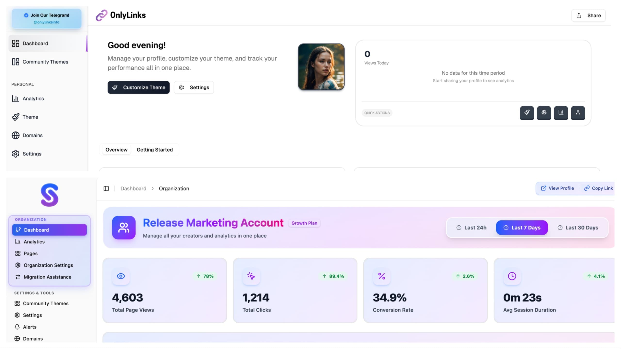
Layout And Navigation
We also ripped apart the layout and rebuilt it in a way that matches how people actually use OnlyLinks.
- "Agencies" are now Organizations, which makes more sense for both teams and brands.
- The sidebar is split into clear sections: Organization, Personal, Settings & Tools, and Admin.
- The active item uses a strong gradient pill, so you always know where you are.
On the page level:
- Hero sections at the top give you the key context for where you are and what you are managing.
- Below that, cards and tables are arranged so your eyes flow from most important to supporting details.
- Multi step flows, like onboarding, use clean progress indicators so the path is obvious.
We also paid attention to how layouts collapse and stretch:
- On larger screens, content breathes and forms split into logical columns.
- On smaller screens, everything stacks in a clean, linear order so you are not hunting for inputs or buttons.
The app feels less like "a lot of pages" and more like one connected workspace that just happens to adapt to whatever screen you are on.
Motion And Micro Interactions
We started using motion as part of the brand, not just as a random effect.
- Hover states give clear feedback without feeling jittery.
- Modals and drawers ease in and out with natural timing, so nothing feels like it teleports.
- Small transitions on tabs, filters, and toggles make the interface feel responsive and modern.
We treated motion like seasoning:
- Enough to make the interface feel alive
- Not so much that it slows you down or makes you dizzy
If an animation ever felt like it was showing off in the middle of real work, we toned it down.
Over time, these tiny interactions add up. The product feels smoother, more intentional, and less like a static HTML admin panel.
Building A Real Design System
One big thing that changed behind the scenes is how we think about components.
In v1, a lot of UI was built in a one off way:
- A card over here
- A button variation over there
- A special table style for one screen
In v2, we treated everything as part of a design system:
- Buttons share the same core structure and states across the entire app
- Cards reuse the same spacing, radius, and elevation tokens
- Inputs, selects, and toggles follow one clear style instead of five half related ones
This means:
- Future features like new dashboards or tools can be built faster
- The visual language stays consistent even as the product grows
- The app feels more trustworthy because nothing looks out of place
You might not see this directly as a user, but you feel it every time a new feature shows up and it just blends in.
New Surfaces: Alerts And Custom Domains
During the redesign we also used the new design system to introduce new features.
Alerts
Alerts needed to be noticeable without feeling aggressive.
- We designed alert surfaces as colored cards that sit inside the layout, not ugly banners slapped on top.
- Icons, short titles, and clear actions keep them readable at a glance.
- They follow the same spacing, radius, and shadow rules as the rest of the system, so they feel native to the product.
You get important information in context, without the UI screaming at you or breaking the flow of the page.
Custom Domains
Custom domains are a big part of making a profile feel like a real brand. The old experience for this was very utilitarian and almost hidden.
Now:
- The custom domains area has its own section and card layout, so it feels like a first class part of the product.
- Inputs, status badges, and connection states are all designed with the same gradient and glassy language as the rest of v2.
- Success and error states use consistent colors and messages, so you know exactly what is happening with your domain.
It feels like part of a professional brand tool, not a configuration checkbox buried in settings.
Working On This With The OnlyLinks Team
This was not a solo design sprint. The last 1.5 months have been a loop of:
- Me exploring layouts, flows, and visual directions
- The team poking holes in them, pointing out edge cases, and bringing real user needs into the conversation
- Iterating on the details until the screens felt right both visually and practically
A lot of the best changes came from tiny comments like:
- "What if this stat was promoted to the top instead of buried?"
- "This looks cool but will confuse a new user, can we simplify it?"
- "This section should feel more important, it looks like a secondary card right now."
The end result is a product that looks like something I would design, but also behaves like something a whole team pressure tested.
Why This Redesign Matters
This was not a "change a few colors" update. We rebuilt the UI and UX from the ground up so that:
- The interface finally matches the level of polish creators expect.
- Organizations can manage real businesses in a space that feels premium, not like a random CRM.
- New features like Alerts and Custom Domains drop into a strong design system instead of creating more visual noise.
- The product feels like a single, coherent OnlyLinks experience, not a folder of disconnected pages.
Honestly, this post does not even scratch the surface of all the tiny layout tweaks, motion changes, and new surfaces that went into v2. There are a lot of little details you only notice when you use it in real life.
If you want to really feel the difference, you will just have to jump in and click around OnlyLinks yourself.
Written by Charbel Habchy • Published November 17 2025
